In such volatile times, let’s see if gold is whispering anything to us.
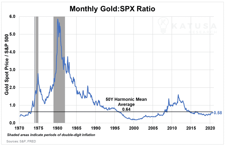
Chart 1: The Gold to S&P 500 Ratio
In this chart you’ll see how the price ratio of one ounce of gold to the price level of the S&P 500 has varied over the years, based on the monthly high closing price of gold.
The higher the ratio, the “more” expensive gold is relative to the S&P 500. The opposite is true when the ratio is below 1.
A return to the 50-year average ratio would mean a gold price of $2,176.84, which would be a 14% increase over the current spot price of gold. This means gold is undervalued by 14% right now, relative to its 50 year average ratio to the S&P 500.
In other words, gold has a long way to run before it gets to its multi-generational average ratio level with the S&P500.
Even at an all-time high close price of $2,063.02 an ounce…
The Gold/S&P500 ratio is still lower than the 50-year average, and
It’s also still 4.5 – 9.6x lower than it was during periods of double-digit inflation.
While the S&P 500 continues pushing its own all-time highs, it’s worth noting that only 239 of its 500 components, less than half, are up year-to-date.
Only 72 of the S&P 500 companies have outperformed gold and only 52 have outperformed the VanEck Gold Miners ETF (GDX).
Miners Freeport-McMoran (NYSE:FCX) and Newmont (NYSE:NEM) are the 50th and 51st best performing stocks in the index, both up over 39% year-to-date. They are the only two base and precious metals mining companies in the S&P 500.
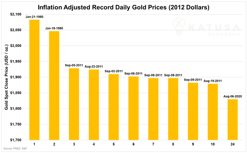
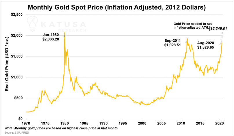
Chart 2: Inflation-Adjusted Gold Price
When gold hit its nominal all-time high close of $2,063.02/oz on August 6th, 2020, it was actually only its 24th best closing price when adjusted for inflation (indexed to 2012 dollars).
Real, or inflation-adjusted, prices can be calculated simply by using any inflation indicator.
The most well-known one is the Consumer Price Index (CPI).
But in this case we’ll be using the GDP Price Deflator, which is generally considered a more robust measure of inflation.
If we look at gold’s top 10 highest daily closing prices after adjusting for inflation, we can see that they were all either in January 1980 or between August-September, 2011.
In 2012 dollars, spot gold would need to hit $2,349.01/oz to match its inflation adjusted all-time high set on January 21st, 1980.
At the current gold spot price of $1867, gold would need to rise $482.01, or 23.3%, just to match that previous all-time high.
This chart might superficially suggest that gold’s current prices aren’t all that impressive.
But inflation measures have their limitations…
So it’s worth taking note any time asset prices hit all-time highs – even in nominal terms.
In either case, the difference between previous inflation-adjusted highs means that gold still has plenty of additional price upside.
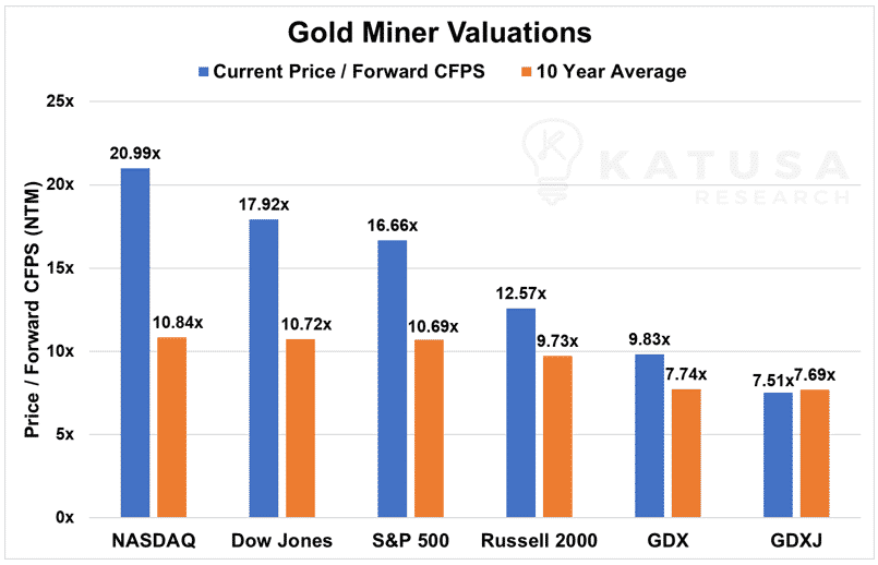
Chart 3: Relative Valuation of Gold Miners
It’s no secret that mining stocks provide great leverage to the underlying metal they produce.
But are gold miners still a bargain in this market?
The short answer is: yes they are, when compared to almost every other industry in the stock market.
This is especially true when you consider that the long-term outlook for gold is bullish.
In the chart below, we look at Price to Forward Cash Flow Per Share (Forward CFPS) multiples. This tell us where stock prices are relative to the cash flows they’re expected to generate over the next twelve months.
Gold miners, and especially senior producers, have benefitted greatly in this bull market.
Yet the multiples for the GDX and GDXJ, the VanEck Gold Senior and Junior Gold Miner ETFs, haven’t shot up as much as the other major market indices.
In fact, GDXJ is even below its 10 year average.
When you hear the words “frothy market”, just look at the NASDAQ and how its Price/Forward CFPS multiple is almost double its 10 year average; or how the big six tech stocks (FAANMG) make up 42% of the NASDAQ Composite’s market cap and 25% of the S&P 500, as of this writing.
All else being equal…
If the price of either the GDX or GDXJ went up by 100%, they would still have lower Price/Forward CFPS multiples than the NASDAQ.
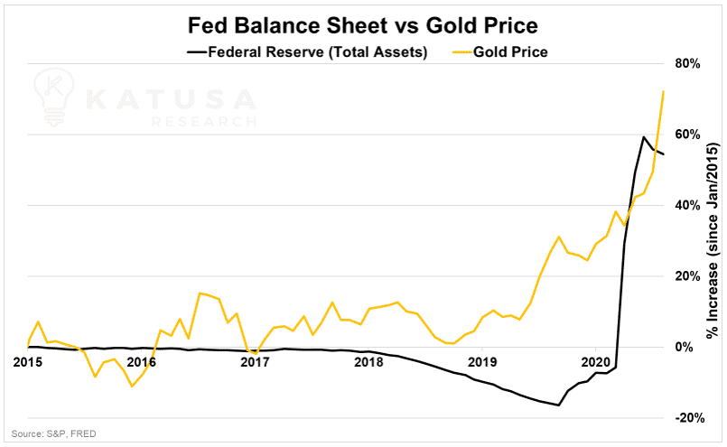
Chart 4: Gold Price vs. Fed Balance Sheet
It’s not the most correlated data set, especially since the Federal Reserve hasn’t changed its gold holdings since April 2006…
But the growth in the Fed’s balance sheet shows the extent of the massive stimulus packages.
Unlimited QE drives down yields. Thus, the Fed’s exploding balance sheet can be viewed as a key supporter of increasing gold prices… since gold becomes a more attractive safe-haven investment when Treasury’s have historically low yields.
While the Fed has continued to disappoint many investors by not committing to a policy of Yield Curve Control and rejecting a negative interest rate policy, low rates should persist until the end of 2022 at the earliest.
The Fed has staked its entire credibility on that timeline.
As a gold investor, it’s worth keeping an eye on Central Bank balance sheets as well as inflation expectations and real yields.
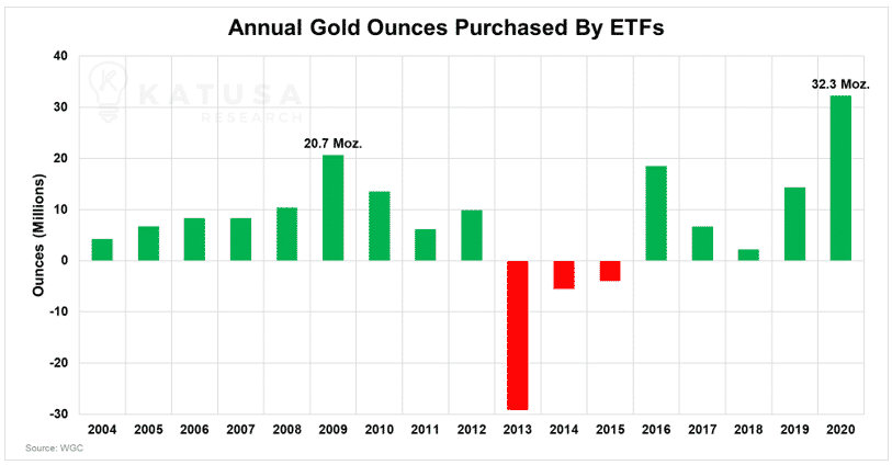
Chart 5: “Paper Gold ETF Fund Flows”
It’s been a record year for gold, and also a defining year for gold-backed ETFs like the SPDR Gold Shares (GLD) or Sprott Physical Gold Trust.
In a year of economic devastation, rampant speculation in financial markets, rock bottom yields and unprecedented changes to monetary policy orthodoxy – gold ETFs have been the vehicle of choice for major hedge funds and individual investors to de-risk and also benefit from surging gold prices.
With two months still left in the year, gold ETFs across the world have already surpassed the previous annual record of gold ounces purchased, 20.7 million ounces (set in 2009), by over 45%.
In fact, that record had already been surpassed mid-way through the year, by June 30th. The additional 11 million ounces purchased since then has just been icing on the cake.
Going for Gold
Based on all of the charts we’ve shown so far…
All signs point to a bullish long-term outlook for gold and gold companies in the coming years.
Of course, that doesn’t preclude a reversal and consolidation of gold prices in the short-term.
If that does happen, there’ll be an incredible opportunity to build up your portfolio for the upcoming gold bull cycle.
In other words, you’ll need to be informed and prepared, so that when the chance comes knocking, you’ll be ready to put your money to work for you.