You know the day destroys the night
Night divides the day
Tried to run, tried to hide
Break on through, to the other side
As I write this, gold is flirting with breaking through $1,350 and it’s getting everyone excited.
Well, the gold bugs that is.
But will gold break on through to the other side like the Lizard King, Jim Morrison, sang so many moons ago?
Every two-rate newsletter that didn’t mention gold a couple years ago now has a gold promotion with their “latest resident gold expert” (Note: nothing more than a well marketed desk jockey).
That alone tells you that retail investors are starting to get interested in gold. The many franchises of newsletters don’t waste time marketing things that don’t sell subscriptions to the retail audience.
Gold is Getting Hot Again on the Institutional Side
Bankers who I knew well during the 2011 gold bull top are back at it attempting to raise equity and clip their fees.
Below is a chart showing gold sentiment on a weekly basis back to 2009. As you can see, we are touching the upper bound of the DSI level. My friend Brent Johnson at Santiago Capital pointed out to me that between Jan 1, 2000 and today, that the DSI (Daily Sentiment Index) on gold has hit 90 and over 220 times. 98 was hit in August 2011.
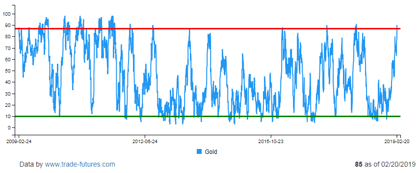
Since then the highest DSI was 91 in Jan 2018. The DSI is just slightly above 85 today, which means we are inching close to the highest DSI ever.
This can be interpreted many ways…
Some can argue this indicator is bearish, others will interpret that as bullish. I personally believe it’s a sign of caution.
Make sure you only own the best names in the sector – as the odds are that gold can correct from here, before it takes off.
What the Gold Commitment of Traders is Saying Right Now
A positive sign for gold is the non-commercial positioning in gold is still at very low levels. It means institutions and fund managers have not been major participants in the rally yet.
Below is a chart which shows the Commitment of Traders Report for Non-Commercial long positions in gold.

This chart is actually quite bullish…
Late last year we were at the lowest positioning level in 3 years and now we have moved off the bottom.
- If gold is going to go on a run, we will need to see continued increases in non-commercial long positions.
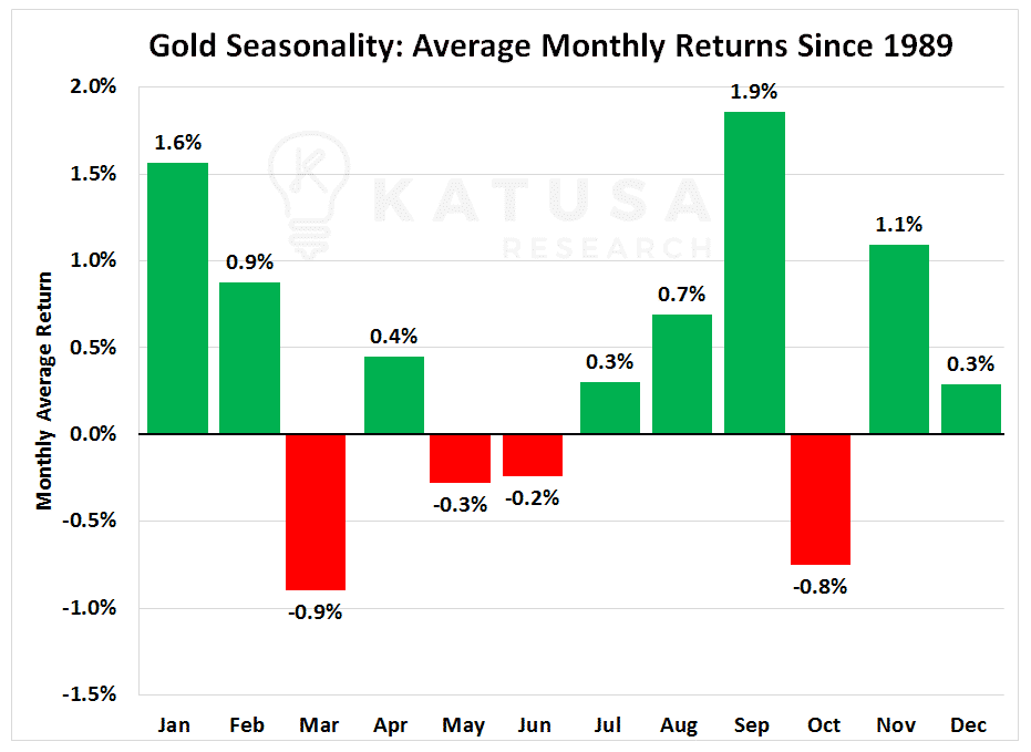
On top of all of that I just went through, February is the 4th strongest month of the year for gold seasonality strength. You can see this in the chart below…
What Really Moves the gold Markets?
The fact is, until the major funds and sovereign wealth funds start buying into the gold story, the equities and the metal won’t start its major ascent.
Let’s first discuss the obvious. Yes, it’s true that:
- Governments have increased their take via taxes, permits, royalties…
- The “cheap and easy” gold has been mined out.
- Timelines and costs to build new mines have increased.
- Unions have increased their share of production, increasing labor costs.
- Every new ounce produced cost more to produce than the previous ounce.
But an interesting stat we found is this:
Since the year 2000, executives made more in compensation per ounce produced than their predecessors…
And it’s a much higher multiple than a mine manager in the 1950s–1970s.
It’s hard to find all the data on this going back to 1900 (we tried). But we are confident from the data we have closely examined that since 2000, executives have taken a much larger chunk of the “gold” than has been given to shareholders when compared to any time in the past.
This was accomplished through high salaries, large compensation packages and unbelievable change of control provisions.
But the biggest reason shareholders have received the mine shaft over the last 8 years:
- DEBT on the balance sheet
The problem with debt is that you eventually need to pay it back. You can’t just dilute it away (especially when priced in USD the last decade).
Let’s dig a bit deeper to see what happened in the gold sector over the last decade.
Just before the Global Financial Crisis (GFC) in 2008, the gold sector was nearly 1:1 on the ratio of equity raised per year to the debt carried on the balance sheets.
This means that for every $1 of equity raised, $1 of debt was added.
Everything changed after the GFC. Executives went wild on debt.
With readily available cheap debt at low rates, the bean counters who keep the books found a new “market” to fund the company’s growth profile. However, we will soon see that this cheap debt is anything but cheap to the shareholders.
The Gold Equity and Debt Chart Below is Stunning…
Gold production is the “gold” line. In blue, you can see the equity raises (selling shares to investors for cash) for the gold sector.
They peaked in 2009 and trended downwards for the next nine years. Debt taken on by the sector is in red. The debt load increased by over 300% during the same time frame.

In 2007, global gold production was 83 million ounces.
That same year, $16.7 billion was raised in equity for the gold sector. And the gold sector carried about $17.7 billion in debt.
To make it simple, let’s call it a 1:1 equity to debt ratio.
Eleven years later, gold sector production had increased by 28 million ounces (33%).
But the debt within the sector increased by $54.4 billion (307%).
In total, $4.15 billion of equity was raised in 2018. This represents a 75% decrease in equity raised compared to 2007.
Your key takeaway:
- The gold sector went from an “almost” 1:1 debt to equity ratio in 2007 to over 17:1 a decade later!
It’s safe to say that the gold sector took part in the “easy/low debt” binge after the Global Financial Crisis.
There are some fundamental questions you need to know…
And there is a definite investment angle to profit from the coming collapse and unwinding of the Golden Leverage.
My subscribers have seen this in action in my newly released February issue of Katusa’s Resource Opportunities.
I just got filled on a gold stock I believe could gain 50-100% within the next 4 months.
Not to mention, our last recommendation in Dec 2018 is up +177%… and still climbing.
If you’re not already and you’re considering becoming a member of my premium research service, click here.
Regards,
Marin